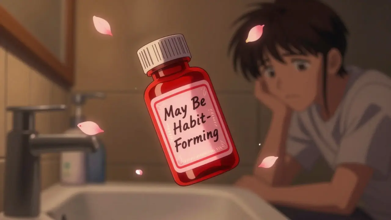
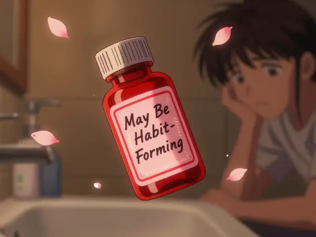
Ever opened your medicine bottle and seen a bright red sticker that says "May Be Habit-Forming"? Or a yellow one that reads "Take with Food"? Those aren’t just decorations. They’re pharmacy auxiliary labels - small but powerful tools designed to keep you safe. And if you’ve ever wondered why some bottles have them and others don’t, or why the colors change, you’re not alone. These stickers are part of a quiet but critical system that helps prevent medication errors, improves adherence, and saves lives - especially when patients forget what their doctor told them just hours after leaving the pharmacy.
Why These Stickers Even Exist
More than half of patients forget key instructions about their meds within two days of getting them. That’s not because they’re careless - it’s because doctors rush, pharmacies are busy, and stress clouds memory. That’s where auxiliary labels come in. They’re not required by federal law, but 48 out of 50 U.S. state pharmacy boards strongly recommend them. Why? Because they work.
A 2022 study in JAMA Internal Medicine found that prescriptions with these labels had an 18.7% higher chance of being taken correctly. That’s not a small number. It translates to about $1,200 saved per patient each year in avoided hospital visits, ER trips, and complications. And across the country, proper use of these labels prevents roughly 127,000 emergency room visits annually - saving an estimated $1.37 billion in healthcare costs.
These aren’t just nice-to-haves. They’re safety nets.
What the Colors Actually Mean
Color coding isn’t random. It’s based on years of patient behavior research and psychology studies. Here’s what each color typically signals:
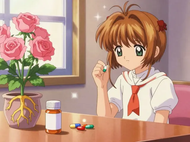
- Red - Critical warning. Think: "May Be Habit-Forming," "Do Not Take with Alcohol," or "Can Cause Drowsiness." About 37% of all auxiliary labels are red. Patients associate red with danger - 87% of them do, according to the American Society of Health-System Pharmacists. That’s intentional.
- Yellow - Caution. This is for things like "Take on an Empty Stomach," "May Cause Dizziness," or "Avoid Sun Exposure." Used in 28% of cases. It’s the "slow down" signal.
- Green - General instruction. "Take with Food," "Shake Well," "Take Once Daily." These make up 22% of labels. Green signals routine, not risk.
- Blue - Storage. "Keep Refrigerated," "Store at Room Temperature," "Protect from Light." Used in 13% of cases. This one’s easy to miss, but it’s vital for drugs like insulin or certain antibiotics.
These colors aren’t federally mandated, but they’re widely followed because they work. A 2018 study showed patients with low literacy understood instructions 47% better when simple icons - like a fork for "take with food" or a snowflake for "refrigerate" - were added alongside the text.
Where They Go Matters More Than You Think
It’s not enough to slap a label on the bottle. Where you put it changes whether the patient sees it.
Most pharmacies still stick labels vertically on the side of the bottle - that’s 82% of prescriptions, according to a 2007 University of Maryland study. But here’s the problem: when you open the cap, your eyes go straight to the label on the front. If the warning is on the side, it’s easy to miss.
Research from the Journal of the American Pharmacists Association found that labels placed on the front - where the cap opens - increase noticeability by 63%. Even better? Horizontal placement (used in only 12% of prescriptions) boosts comprehension by 31% compared to vertical.
Some pharmacies now use "interactive" placement: the label is under the cap, so you have to twist it open to see it. That forces attention. It’s not common yet, but it’s growing.
What You’ll See Most Often
Not all labels are created equal. Some are used far more than others. Here’s what’s actually on your bottles right now:
- "Take with Food" - Found on 41% of NSAID prescriptions (like ibuprofen or naproxen). Prevents stomach upset.
- "Take Until Finished" - Used on 68% of antibiotic prescriptions. Stops people from stopping early because they feel better - a major cause of antibiotic resistance.
- "Do Not Take with Alcohol" - Appears on 27% of antibiotic prescriptions and nearly all painkillers. Mixing alcohol with these can cause liver damage, dizziness, or even fatal reactions.
- "Keep Refrigerated" - Required for 18% of biologic medications, like insulin or certain injectables. If you leave these out, they lose potency.
And here’s something surprising: 15-25% of prescriptions that should have auxiliary labels don’t. That’s not because pharmacists are lazy - it’s often because systems are outdated, or staff are overwhelmed. A 2016 University of Illinois study found that even when guidelines say a label is needed, it’s skipped nearly one in five times.
What’s Wrong With the System
Despite their benefits, auxiliary labels have serious flaws.
First, clutter. About 31% of prescriptions have more than three labels. Too many, and patients tune them out. The Institute for Safe Medication Practices recommends no more than one to three per bottle. But when a patient is on five meds, each with three labels? That’s 15 stickers. It’s overwhelming.
Second, confusion. A 2021 Johns Hopkins study found that 22% of patients misunderstood common labels. "Take with Food" was often mistaken for "Take after Meals" - which can actually reduce how well the drug works. "Take on an Empty Stomach" got confused with "Take Before Meals." These aren’t just semantics. They’re safety risks.
Third, language. One in four Americans speaks a language other than English at home, according to the 2022 U.S. Census. But only 22% of pharmacies consistently offer auxiliary labels in Spanish, Chinese, Bengali, or other languages. That’s not just unfair - it’s dangerous.
And then there’s the cost. Standardizing labels across pharmacies would save lives. But it would cost each pharmacy around $2,400 to update their systems. Only 38% have done it.
What’s Changing Right Now
The system is evolving - slowly, but it is.
California’s AB-1352, effective January 1, 2024, now requires specific auxiliary labels on high-risk medications like opioids, benzodiazepines, and blood thinners. The FDA also released draft guidance in September 2023 pushing for stronger opioid warning labels.
Technology is creeping in. Seventeen percent of chain pharmacies now test QR codes on labels that link to short video instructions in multiple languages. Some hospitals are piloting smart labels - temperature-sensitive ink that changes color if insulin or other biologics have been left out too long.
And by 2025, 62% of major pharmacy chains plan to have digital versions of auxiliary labels accessible through their apps. But here’s the catch: federal rules still require every prescription to have a visible, permanent physical label. Digital can’t replace it - not yet.
What You Can Do
You don’t have to wait for the system to fix itself. Here’s how to protect yourself:
- Read every label, even if you’ve taken the drug before. Instructions can change. A label you saw last month might be different now.
- Ask for a pictogram. If you’re confused, ask the pharmacist: "Can you show me a picture of what this means?" Many now have sticker sheets with icons.
- Request a label in your language. If you don’t speak English well, ask for a translated label. It’s your right.
- Take a photo of your label. Keep it in your phone. It’s easier than remembering.
- Speak up if something doesn’t make sense. "This says ‘take with food’ - does that mean with breakfast or any meal?" Pharmacists are trained to explain this. Don’t assume.
And if you’re ever unsure - call your pharmacy. They’re paid to answer these questions. Don’t guess. Medication errors don’t just happen in hospitals. They happen in kitchens, bathrooms, and cars - because someone didn’t understand a sticker.
Final Thought
These little stickers are one of the most underappreciated tools in modern medicine. They’re not flashy. They don’t cure disease. But they prevent mistakes that can kill. And they work - if they’re clear, if they’re placed right, if they’re understood.
Next time you pick up a prescription, pause. Look at those colors. Read the words. Ask a question. You’re not just taking a pill. You’re participating in your own safety.


Ayush Pareek January 16, 2026
These labels are lifesavers. I used to ignore them until my dad ended up in the ER because he took his blood thinner with grapefruit juice. Now I check every bottle like it’s a treasure map. Small things, big consequences.
Nishant Garg January 18, 2026
Man, in India we don’t even get these stickers half the time. Pharmacies hand you a plastic bag with a pill bottle and say ‘take it twice a day’ - no color, no icons, no translation. I’ve seen grandmas give insulin to their dogs because the label was in English and they thought it said ‘for pain.’ We need this system here, not just in the US.
Iona Jane January 19, 2026
They’re watching you. The red stickers? The QR codes? It’s not about safety - it’s about tracking what you take. They want to know if you’re taking your antidepressants. Or your blood pressure meds. Or your insulin. Next they’ll put microchips in the caps. You think this is healthcare? It’s surveillance with a stethoscope.
Jaspreet Kaur Chana January 19, 2026
Bro, I just got my first prescription after my surgery and I was like ‘what the heck are all these stickers?’ But then I read ‘Take with Food’ and realized - ohhh, that’s why I felt sick last time. Now I snap pics of every label. My phone’s full of medicine selfies. It’s wild how much you learn when you stop assuming and start reading.
Haley Graves January 20, 2026
If you’re not asking your pharmacist for a pictogram, you’re gambling with your health. I’ve worked in clinics for 12 years. The people who die from medication errors? They didn’t ignore the label. They just didn’t understand it. Language matters. Icons matter. Clarity matters. Stop treating patients like they’re supposed to decode corporate jargon.
Diane Hendriks January 21, 2026
The fact that auxiliary labels aren’t federally mandated is a national disgrace. We spend billions on pharmaceutical R&D while ignoring the simplest, most cost-effective safety mechanism ever invented. This isn’t a ‘recommendation’ - it’s a moral imperative. And the fact that 22% of patients misunderstand ‘take with food’? That’s not incompetence - it’s systemic negligence.
ellen adamina January 22, 2026
I never noticed how many labels I ignore until my mom got dementia. Now I read every one out loud to her. Some say ‘shake well’ - I didn’t even know you had to shake some bottles. Others say ‘keep refrigerated’ - and I’ve left insulin on the counter for days. I’m not mad at anyone. I’m just glad I found this post before something bad happened.
Gloria Montero Puertas January 23, 2026
Oh, so now we’re giving people *stickers* to read? What’s next? Coloring books for diabetics? This is pathetic. If you can’t follow basic medical instructions, maybe you shouldn’t be taking prescription drugs at all. The real problem isn’t the label - it’s the people who treat their bodies like a game of Russian roulette with a pharmacy receipt.
Tom Doan January 23, 2026
Interesting that you mention QR codes… but you don’t mention that 34% of Americans over 65 don’t own a smartphone. So now we’re ‘modernizing’ safety by excluding the demographic that needs it most? Brilliant. The real innovation would be training pharmacists to speak slowly, clearly, and without jargon - not slapping a barcode on a bottle and calling it a day.
Sohan Jindal January 24, 2026
They’re pushing this ‘label’ stuff because Big Pharma doesn’t want you to know how dangerous these drugs really are. If you knew how many people die from ‘Take with Food’ mistakes, you’d be screaming. This is all a distraction. The real solution? Ban most of these pills. Let people eat real food and sleep more.
Arjun Seth January 26, 2026
People don’t need stickers - they need discipline. I’ve been taking metformin for 10 years. I never read a label. I just take it. If you can’t remember to take your medicine, maybe you’re not ready for adulthood. This whole system is just coddling people who should’ve learned basic responsibility by 18.
Mike Berrange January 28, 2026
So now we’re blaming pharmacists for not putting labels on bottles? Let’s be real - the system is broken. I’ve had prescriptions where the label said ‘take once daily’ but the bottle said ‘take twice.’ The pharmacist didn’t notice. The doctor didn’t notice. The pharmacy software didn’t notice. You think a sticker is going to fix that? Please. We need a full audit. Not stickers. Accountability.
Jan Hess January 29, 2026
Just got my first insulin prescription. The pharmacist handed me the bottle, then pulled out a laminated card with pictures: fork for food, snowflake for fridge, clock for time. Said, ‘This is what your label means.’ I cried. Not because I’m emotional - because someone finally treated me like a human, not a barcode.